
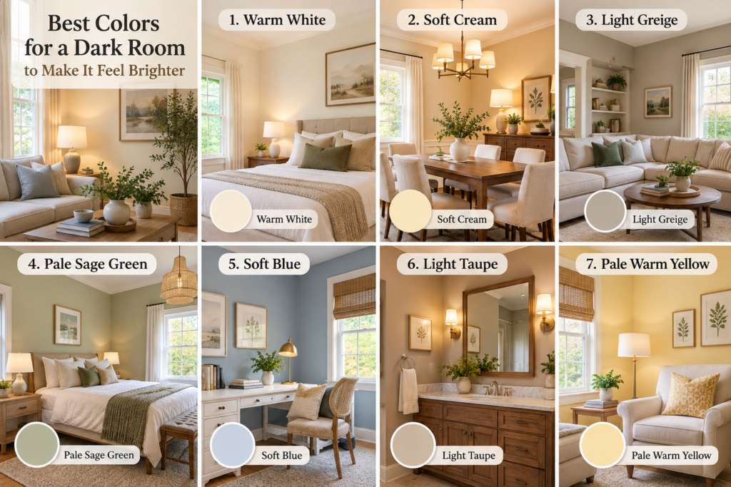
Choosing the right colors for a dark room can make a surprisingly big difference in how open, comfortable, and inviting the space feels. But here’s something many homeowners discover the hard way: simply painting a low-light room bright white doesn’t always make it look brighter. Without enough natural light, some whites can actually appear flat, gray, or even a little cold.
The better approach is to work with the light your room already has. Warm whites, creamy neutrals, soft greiges, muted greens, and gentle blues can reflect available light while adding enough warmth and depth to keep the room from feeling washed out.
This is especially useful in north-facing bedrooms, small living rooms, hallways, basement family rooms, and other spaces in American homes that don’t receive strong sunlight throughout the day. The direction of your windows, surrounding finishes, and even your flooring can influence how a paint color looks once it’s on the wall.
Instead of searching for one magical shade, we’ll look at the color families that tend to work beautifully in darker spaces—and how to choose one that makes sense for your own room.
1. Warm White: One of the Best Colors for a Dark Room

Warm white can make a low-light room feel brighter without the cold, flat appearance that crisp whites sometimes develop when natural light is limited. Its subtle creamy undertones bring warmth while still keeping the walls fresh and airy.
Best for: North-facing living rooms, bedrooms, hallways, and spaces with smaller windows.
Pair it with: Natural oak, walnut, cream linen, warm beige, muted olive, and aged brass.
Watch out for: Cool whites with strong blue or gray undertones, which may look dull or chilly in limited daylight.
Designer tip: Test a large paint sample on at least two walls before committing. Check it during the day and again under your evening lighting—the undertone can change noticeably as the light changes.
2. Soft Cream for a Warmer, Brighter Feel
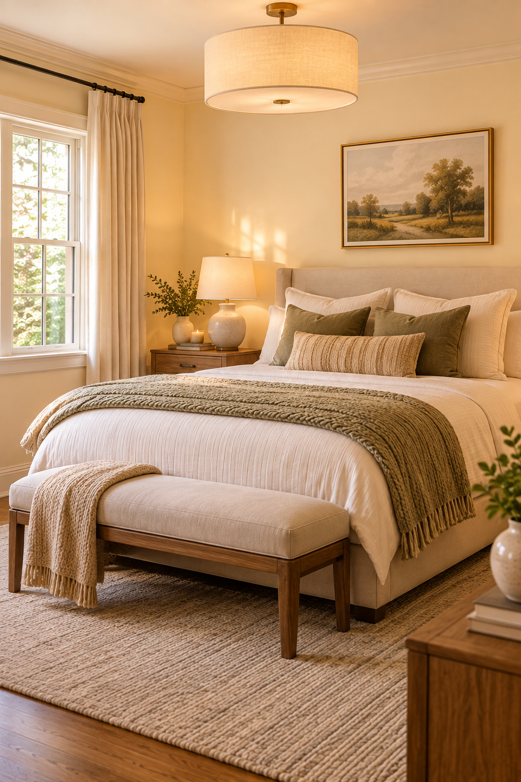
Soft cream is a beautiful alternative when white feels too stark for a darker room. Its gentle yellow-beige undertones add warmth to limited natural light, helping the space feel cozy and softly illuminated rather than cold or washed out.
Best for: Bedrooms, dining rooms, traditional living rooms, and north-facing spaces that need extra warmth.
Pair it with: Medium-tone wood, warm white trim, oatmeal linen, sage green, soft brown, and antique or brushed brass.
Watch out for: Creams with very strong yellow undertones. In warm artificial lighting, they can become more yellow than expected.
Designer tip: Compare your cream sample directly against the room’s trim. If the trim is a cooler white, choose a softer cream with a restrained undertone so the difference feels intentional rather than mismatched.
3. Light Greige for Soft, Balanced Neutrality

Light greige gives you the warmth of beige with just enough gray to keep the room feeling fresh and current. In a darker space, a light warm greige can create a soft backdrop without the starkness of white or the heaviness of a deeper neutral.
Best for: Living rooms, family rooms, bedrooms, and open spaces with limited natural light.
Pair it with: Warm white trim, natural oak, cream upholstery, muted green, woven textures, and matte black or aged brass accents.
Watch out for: Greiges with strong cool-gray undertones. In a north-facing or particularly dark room, they can shift noticeably gray and make the space feel more shadowed.
Designer tip: Look at your flooring before choosing a greige. Warm wood floors usually work beautifully with warmer greiges, while a shade that’s too cool can create an unintended contrast.
4. Pale Sage Green for a Fresh, Natural Lift
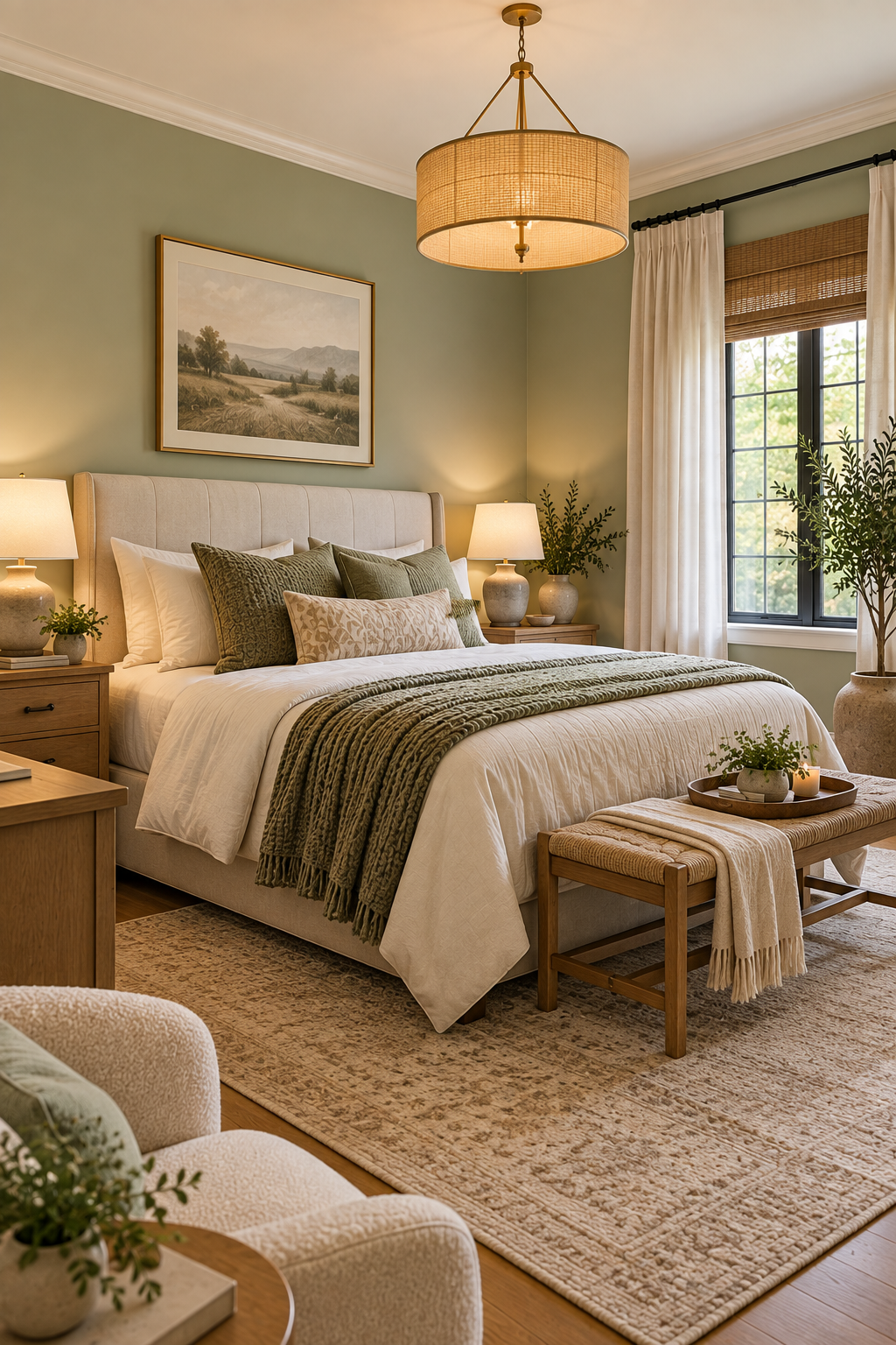
Pale sage green can bring gentle color into a dark room without making it feel smaller or heavier. Its soft, earthy character works especially well when you want something more interesting than a neutral while still keeping the room calm and easy to live with.
Best for: Bedrooms, home offices, bathrooms, reading rooms, and cozy living spaces.
Pair it with: Warm white, cream, natural oak, walnut, linen, woven textures, and aged brass.
Watch out for: Sage shades with too much gray. In very limited natural light, they can become muddy or noticeably darker than they appeared on the paint sample.
Designer tip: Look for a sage that still feels fresh in the darkest corner of the room. If it turns gray there during the day, try a slightly lighter or warmer version before committing.
5. Soft Blue for an Airy, Relaxed Feel
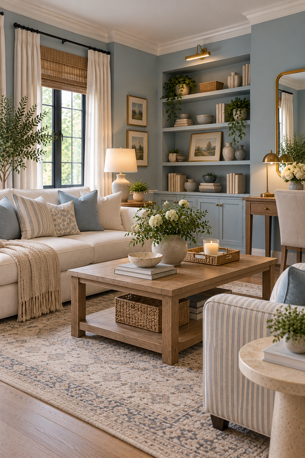
Soft blue can give a darker room a sense of openness without relying on white or beige. A muted blue with a gentle warm or slightly gray undertone feels calm and sophisticated while adding enough color to give the room personality.
Best for: Bedrooms, home offices, reading rooms, bathrooms, and relaxed living spaces.
Pair it with: Warm white trim, cream upholstery, medium-tone wood, natural linen, cognac leather, and brushed brass.
Watch out for: Very icy or strongly blue-gray shades. In a north-facing room, cool daylight can exaggerate those undertones and make the space feel colder than expected.
Designer tip: If your room already receives cool light, test a slightly warmer, softer blue rather than the palest blue on the paint card. It can still feel fresh while looking much more comfortable throughout the day.
6. Light Taupe for Warm, Understated Elegance
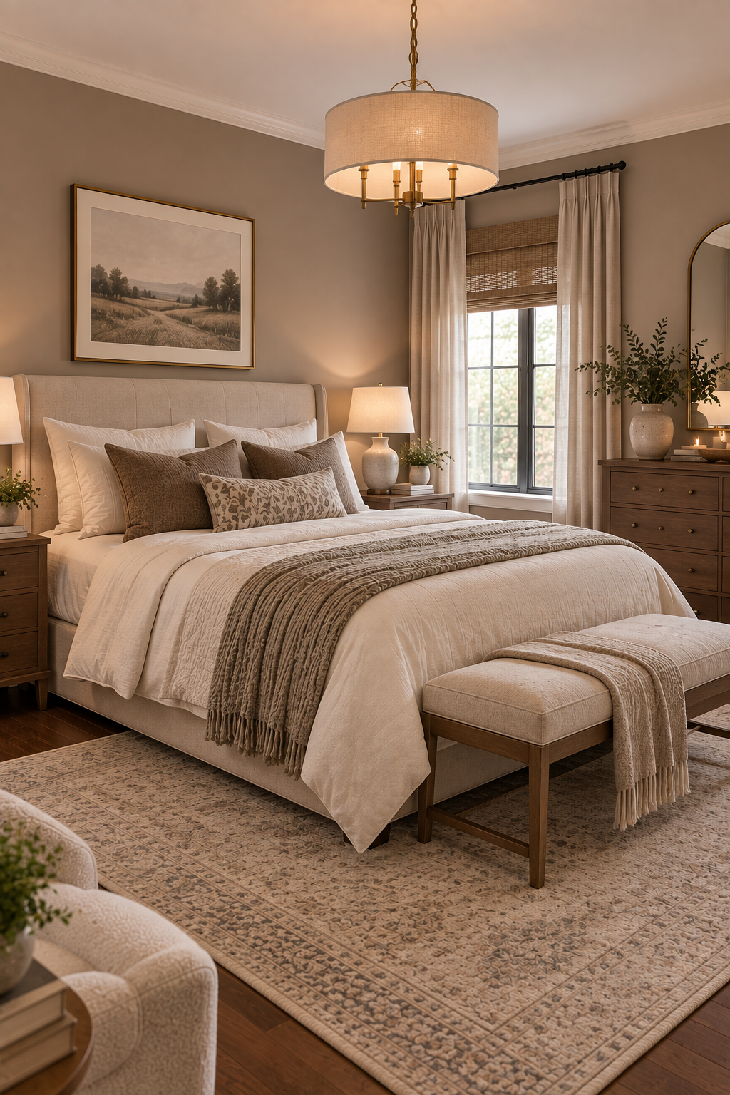
Light taupe is a great choice when you want a darker room to feel brighter without losing warmth or depth. Sitting somewhere between beige, gray, and soft brown, it creates a sophisticated neutral backdrop that feels especially comfortable in rooms where bright white would look too harsh.
Best for: Bedrooms, entryways, living rooms, hallways, and cozy spaces with warm artificial lighting.
Pair it with: Cream, warm white, walnut, medium-tone oak, oatmeal linen, muted olive, and antique brass.
Watch out for: Taupes that are too deep or heavily gray. Without much daylight, they can absorb more light and make the walls feel heavier than intended.
Designer tip: Choose a taupe that’s noticeably lighter than the shade you initially gravitate toward. Paint colors often appear deeper once they’re covering four walls—especially in a room that already receives limited natural light.
7. Pale Warm Yellow for a Soft, Sunlit Glow
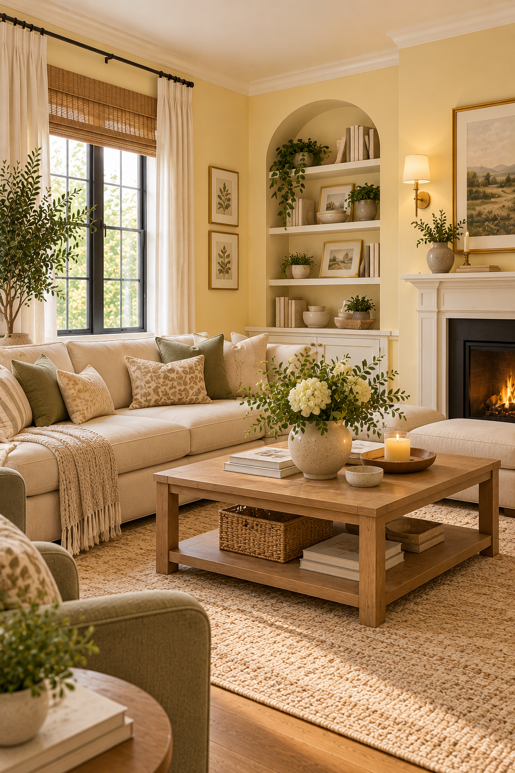
Pale warm yellow can bring a subtle sense of sunshine to a room that doesn’t receive much of the real thing. The key is choosing a soft, creamy shade rather than a bright lemon yellow, so the walls feel gently illuminated instead of overly colorful.
Best for: Breakfast nooks, kitchens, living rooms, guest rooms, and north-facing spaces that tend to feel a little gloomy.
Pair it with: Warm white, natural oak, cream linen, soft green, light brown, woven textures, and aged brass.
Watch out for: Strong or highly saturated yellows. Warm light bulbs can intensify them at night and make the room look much more yellow than expected.
Designer tip: Test pale yellow beside both your flooring and your evening lighting. Look for a shade that reads almost like a warm neutral at first glance—the subtle versions are usually the easiest to live with.
Choosing the Right Color for Your Dark Room
The best paint color isn’t simply the lightest shade on the fan deck. A color that looks beautiful in a sunny showroom can behave very differently in a room with limited natural light.
Before making your final choice, pay attention to your window direction, flooring, furniture, trim, and the artificial lighting you use at night. Warm white may be perfect in one home, while soft cream, sage, or even pale blue could feel much more natural in another.
Most importantly, always test your favorite colors for a dark room on the actual walls before buying several gallons. Live with the samples for a few days and look at them in morning light, afternoon shadows, and evening lamplight. The right color should make the room feel comfortable throughout the entire day—not just during the brightest hour
Frequently Asked Questions About Colors for a Dark Room
What color makes a dark room look the brightest?
Warm whites, soft creams, and other light colors with gentle warm undertones can help a dark room feel brighter. However, the best choice depends on the direction of the natural light, flooring, furniture, and artificial lighting in the room.
Should you paint a dark room white?
You can, but avoid assuming that the brightest white will automatically create the brightest room. A stark or cool white may look gray and flat when there isn’t enough natural light to reflect. A warmer white or soft cream is often more forgiving in low-light spaces.
Are warm or cool colors better for a dark room?
Warm colors are often easier to use in rooms with limited or cool natural light, but that doesn’t mean you have to avoid blues or greens. Soft, carefully chosen versions of cooler colors can still work beautifully. The undertone matters more than simply labeling a color warm or cool.
Should the ceiling be lighter than the walls in a dark room?
A light ceiling can help maintain an open feeling, especially when paired with a slightly deeper wall color. Warm white is a versatile option, but always compare it with your wall color so the two undertones work together rather than making one look unexpectedly yellow, gray, or pink.