Disclosure: As an Amazon Associate, I earn from qualifying purchases. This means I may receive a small commission if you purchase through links in this post, at no additional cost to you.
An awkward empty wall can make an otherwise finished room feel incomplete. These gallery wall layout ideas use different frame arrangements and proportions to turn blank spaces into balanced, intentional focal points without overwhelming the room.
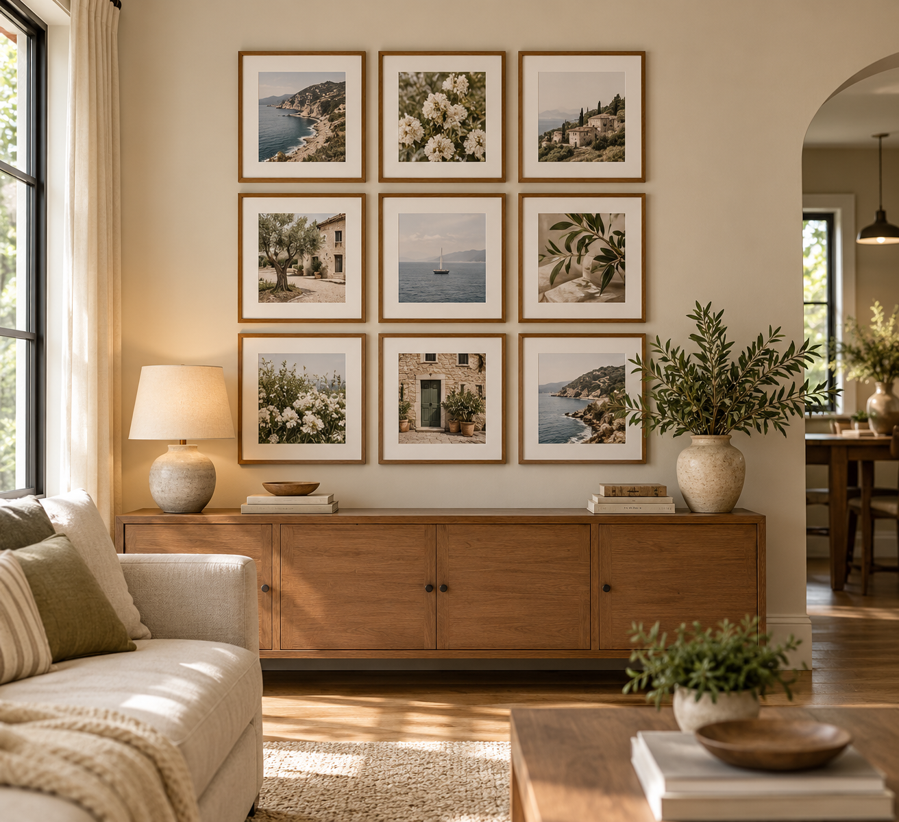
1. Gallery Wall Layout Ideas: Create a Clean Symmetrical Grid
Bring instant order to a blank wall.
A symmetrical grid uses matching frames, consistent spacing, and evenly sized artwork to create a polished focal point. Try a 3×3 arrangement on a wide empty wall for a collected look that still feels calm and intentional.
Why It Works: The repetition and equal spacing make a large blank wall feel balanced without adding visual clutter.
Best For: Living rooms, entryways, dining rooms, and wide walls above consoles.
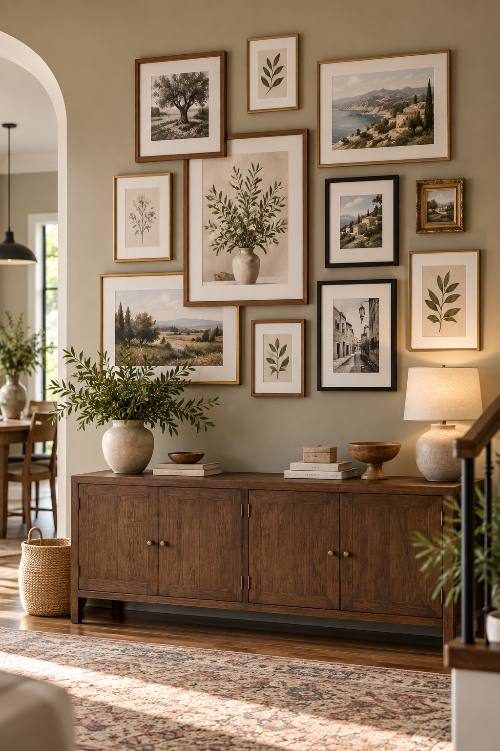
2. Create a Relaxed Look With Mixed-Size Frames
Let the arrangement feel collected.
Mix portrait and landscape frames in several sizes to create an organic gallery wall that feels layered rather than perfectly structured. Keep the spacing fairly consistent and repeat a few frame finishes to make the varied arrangement still feel connected.
Why It Works: Different frame sizes fill an awkward blank wall naturally while giving the display more character and movement.
Best For: Entryways, living rooms, hallways, and large irregular wall spaces.
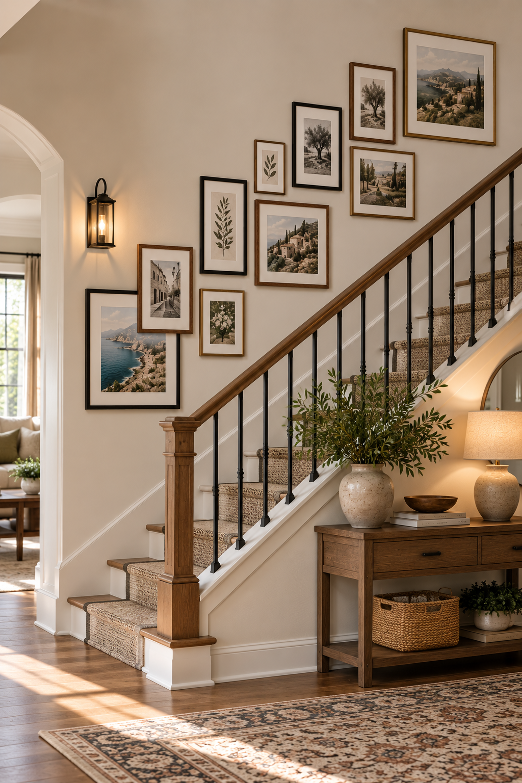
3. Follow the Staircase With a Stepped Gallery Wall
Turn the staircase into a focal point.
Arrange frames so the overall composition rises along the same angle as the stairs. Mixing a few frame sizes keeps the display interesting, while consistent spacing helps the entire gallery feel intentional instead of scattered.
Why It Works: The stepped arrangement follows the architecture of the staircase and makes use of a large wall that can otherwise be difficult to decorate.
Best For: Staircases, split-level entries, and tall angled walls.
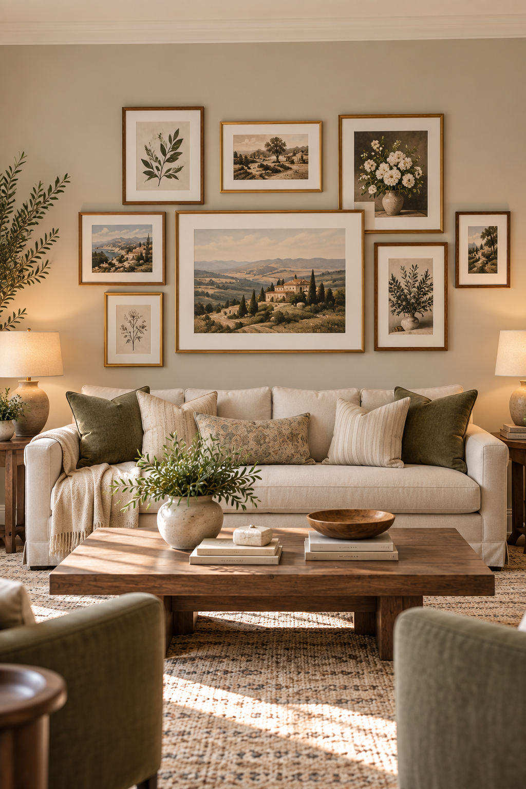
4. Center a Balanced Gallery Wall Above the Sofa
Give the sofa a stronger backdrop.
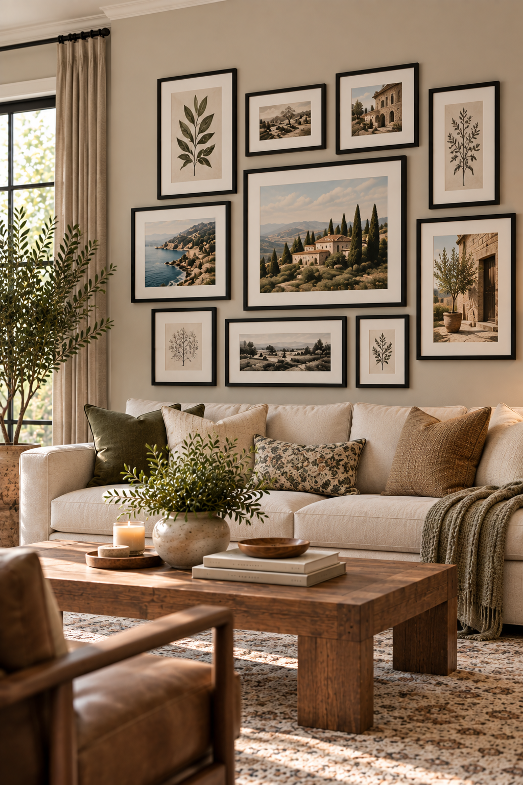
Center a group of frames above the sofa and keep the overall arrangement narrower than the furniture below it. Combining one or two larger pieces with smaller frames creates variety while keeping the composition visually balanced.
Why It Works: Using the sofa as an anchor helps a large empty wall feel connected to the rest of the room.
Best For: Living rooms, family rooms, sectionals, and wide walls above seating.
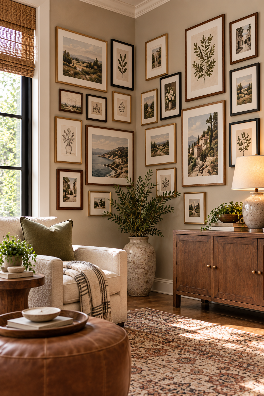
5. Wrap a Gallery Wall Around an Awkward Corner
Make an empty corner feel intentional.
Instead of stopping the artwork at one wall, continue a collection of frames around the corner to connect both surfaces. Mix a few sizes while keeping the artwork and frame finishes coordinated so the two walls still feel like one display.
Why It Works: Extending the arrangement across both walls turns an overlooked corner into a cohesive focal point.
Best For: Reading nooks, living room corners, entryways, and other awkward two-wall spaces.
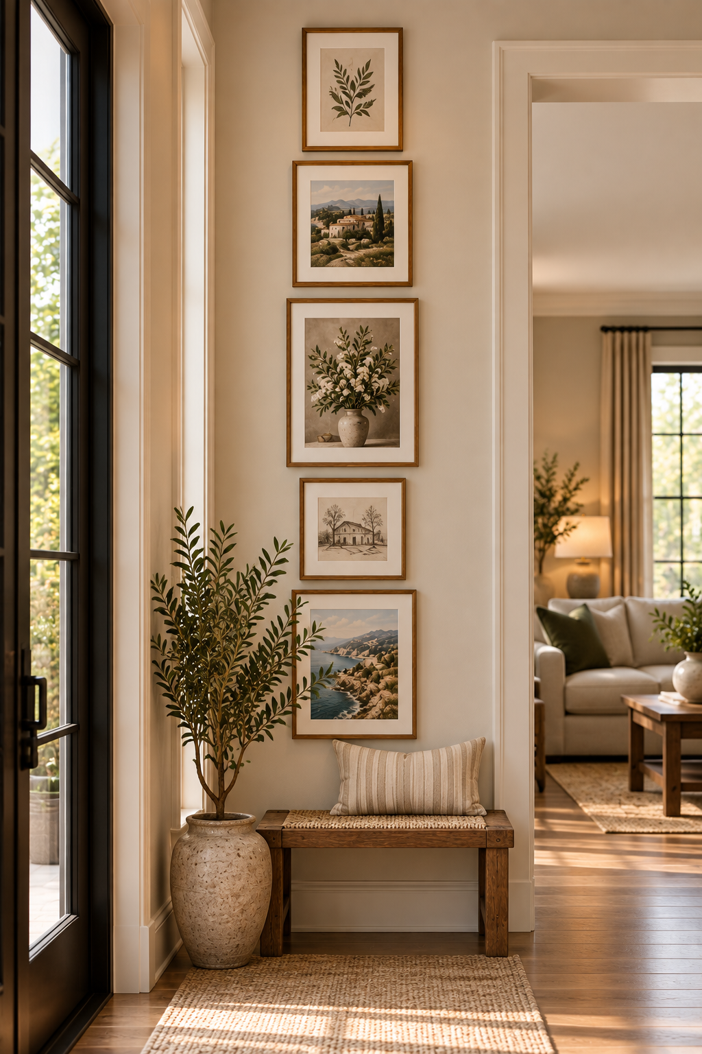
6. Fill a Narrow Wall With a Vertical Gallery Layout
Make a narrow wall feel useful.
Arrange a small collection of frames vertically to decorate a tall, awkward wall without making the space feel crowded. Keeping the frames within a similar width creates a clean visual line while still allowing different artwork sizes.
Why It Works: The vertical arrangement uses wall height instead of width, making it ideal for spaces where a traditional gallery wall won’t fit.
Best For: Hallways, narrow entryways, walls between doorways, and small transitional spaces.
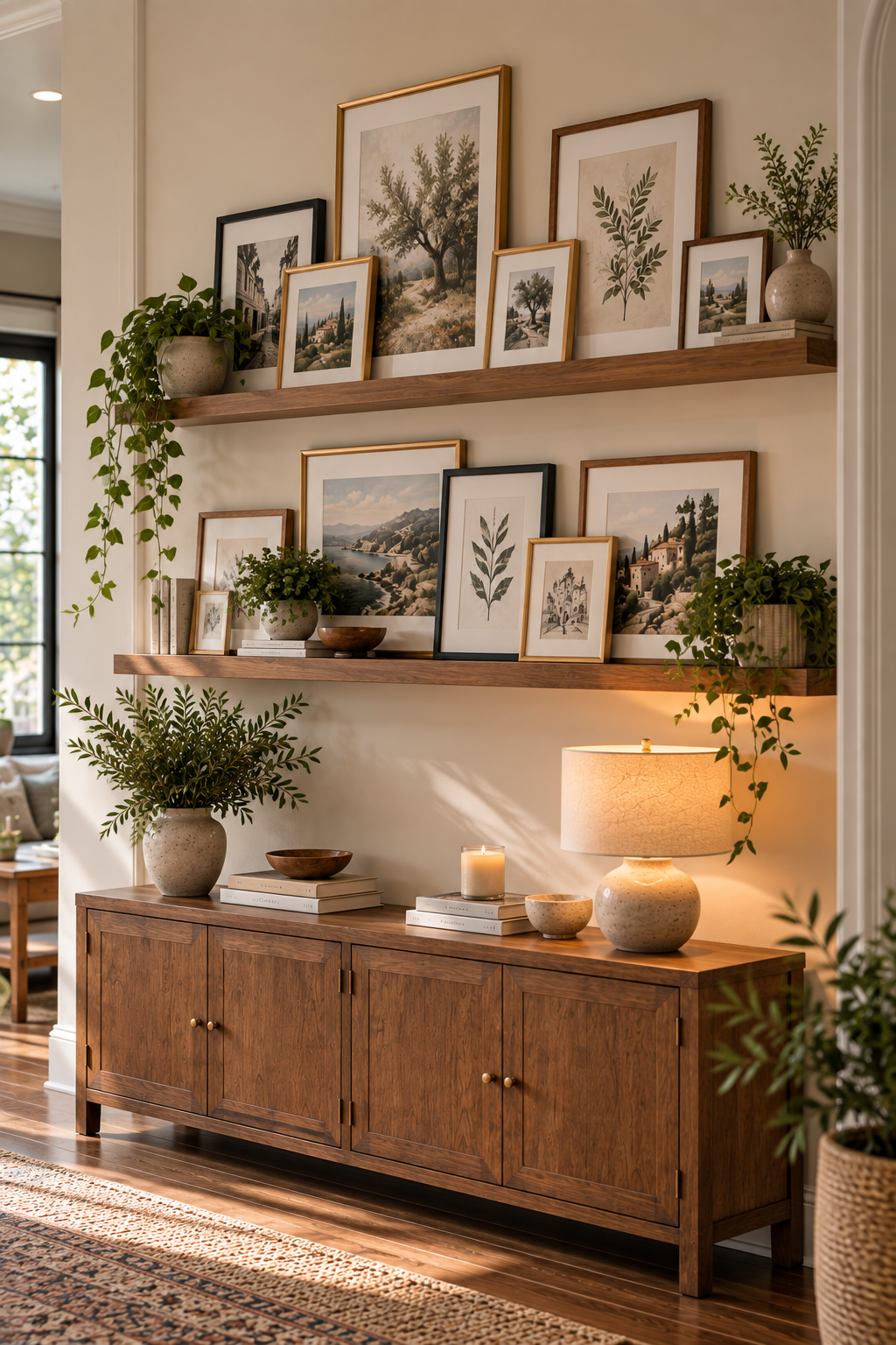
7. Layer Frames on Picture Ledges for a Flexible Gallery Wall
Layer artwork without overthinking placement.
Picture ledges let you lean and overlap frames instead of hanging every piece individually. Mix several frame sizes across one or two ledges to create a collected look that can easily be rearranged whenever you want a change.
Why It Works: The ledges make an awkward wall easier to style while giving you the freedom to move or swap artwork without creating new holes.
Best For: Living rooms, entryways, home offices, and walls where you like to change artwork often.
8. Create Contrast With a Black Frame Gallery Wall
Add definition with black frames.
Matte black frames give mixed artwork a consistent look while creating crisp contrast against a light wall. Combine several frame sizes and orientations so the arrangement feels collected, while the matching finish keeps everything visually connected.
Why It Works: Repeating the same black finish creates cohesion even when the artwork and frame sizes are different.
Best For: Living rooms, home offices, dining rooms, and large neutral walls.
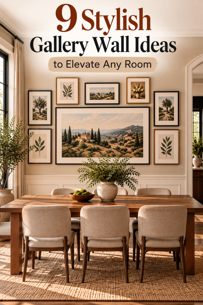
9. Anchor the Gallery Wall With One Oversized Centerpiece
Start with one strong focal point.
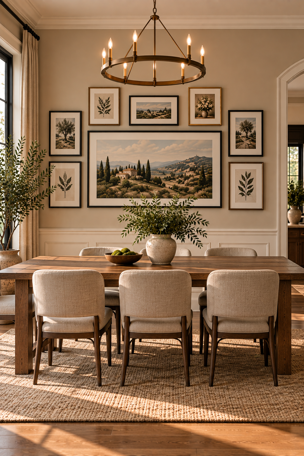
Choose one oversized artwork as the centerpiece, then arrange smaller frames around it to fill the remaining wall space. Keeping the surrounding pieces noticeably smaller creates a clear visual hierarchy while still giving you the layered look of a gallery wall.
Why It Works: The large centerpiece gives the arrangement an obvious anchor, making an expansive empty wall easier to balance.
Best For: Dining rooms, living rooms, large entryways, and wide statement walls.
Frequently Asked Questions
How do I choose the right gallery wall layout?
Start with the shape and size of the empty wall. Wide walls work well with grids or horizontal arrangements, while narrow walls and staircases usually look better with layouts that follow the architecture of the space.
How much space should I leave between gallery wall frames?
A consistent gap of about 2–3 inches between frames is a good starting point. Keeping the spacing similar throughout the arrangement helps different frame sizes feel connected.
Should all the frames in a gallery wall match?
Not necessarily. Matching frames create a clean, structured look, while mixing wood, black, and metal finishes can feel more collected and relaxed. The key is repeating at least one color, material, or style so the arrangement feels intentional.
Final Thoughts
An awkward empty wall doesn’t need more decor—it just needs the right arrangement. From structured grids to relaxed mixed-frame displays, the best gallery wall layout ideas work with the shape and proportions of the space instead of fighting against them.
Choose the layout that fits your wall first, then build your frame collection around it for a display that feels balanced, personal, and intentional.